
A DYNAMIC NEW PLATFORM
Ruby Realty is female-owned Real Estate Brokerage that specializes in helping first-time buyers, underrepresented communities, and investors navigate the often-intimidating real estate process with confidence. They required a style guide, website design, email template, and site standup.
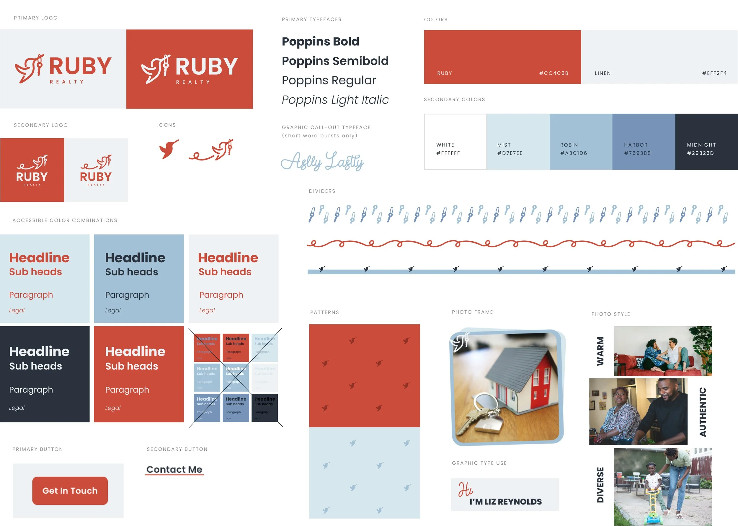
Ruby Realty Website, Email Template & Style Guide
Role: Graphic Designer, Site Designer, Animator
Core Partner: Liz Reynolds
Ruby Realty logo by: Dani Coffield
GOALS:
Take the existing logo, colors, and typography and transform them from static brand assets into a living, breathing visual identity that feels warm, professional, and approachable. Build a website that not only looks beautiful but does the heavy lifting: clearly communicating Ruby Realty’s values and unique offerings, and making it easy for visitors to understand what sets them apart. Ensure the site inspires trust from homeowners, sellers, and buyers, with clean design, strong imagery, and intuitive structure, so that potential clients feel confident engaging Ruby Realty. Create an experience that is both responsive and accessible: mobile-friendly, fast-loading, and easy to navigate.
THE WORK:
I expanded on Ruby Realty’s existing visual toolkit by creating brand-driven website UI components that echo their logo, color palette, and typography, bringing consistency to buttons, headers, cards, and iconography to reinforce brand personality. I mapped out user flows so that visitors could easily find key info: who Ruby Realty is, what makes them different, what services they provide, and testimonials. I chose photography that evokes warmth, professionalism, and inclusive homeownership. I also applied responsive design techniques and performance optimization: ensured quick load times, optimized images, mobile menu behaviors, legible type sizes on small screens, and tested cross-browser compatibility.
SUCCESSES:
The new Ruby Realty website brings their brand identity to life online—warm, welcoming, and professional. This cohesive, communicative platform inspires trust and reflects the heart of their business. By expanding their logo, colors, and typography into a fuller digital system, the brand now communicates its values with clarity and consistency. The result is a site that beautifully reinforces Ruby Realty’s presence and personality in the market.
Email Template
Desktop version prioritizes bold headlines, breathing room between content, and limited copy.
Mobile version scales to accessibly fit varying screen sizes